Day324: Tarifa “Raw Presence”
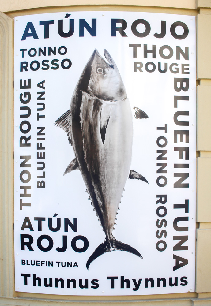
I arrived in Tarifa, a seaside town in southern Spain. From here, it takes only about an hour by ferry to reach Morocco in Africa. As one would expect from a coastal town, it is apparently famous for tuna. There, I noticed a poster on a wall showing a tuna exactly as it is — in its complete, unmistakable form. That image left a strong impression on me.
The colors are harmonious, but the typography is fairly simple. The layout is nothing special. It is, in many ways, an ordinary poster. And yet, I found myself drawn to it. In Japan, we would probably never think to place a whole tuna, shaped like a fish, boldly at the center of a visual. In Japan, tuna is usually presented as slices, emphasizing the rich red flesh. Most often, it appears in advertisements for family-friendly sushi restaurants, accompanied by promotional offers and pricing information. We rarely encounter a simple visual that presents the tuna in its full form. Beef and chicken are also shown only after they have become meat. In recent years, I often feel that in Japan we have grown distant from the physical presence of life at the dining table — a contrast that becomes apparent when seeing whole animals hanging in markets overseas. This poster made me realize that graphic design can convey more than techniques such as typography, layout, or color. It can also remind us of the raw material itself — and the life behind it.
スペインの海沿いの街、タリファにやってきた。船で1時間渡ればアフリカ大陸のモロッコに着く。海沿いの街だけあって、マグロが有名らしい。そこでマグロがマグロの姿のままのポスターが壁に貼ってあったのがとても印象に残った。
色の調和はとれてるけど、書体の使い方は割と単純で、何でもないポスターなんだけどなんかいいなと思った。日本人はきっと魚の姿をしたマグロを真ん中に置いたビジュアルを思いつかず、マグロは切り身にしてその赤さを見せたくなる。その切り身が載るのは大抵ファミリー向けの寿司屋の広告で、そこにお得な情報とともに賑やかに見せられており、シンプルなマグロ姿のビジュアルを見ることがない。牛も鳥も肉になっているし、近年の日本では食卓からいのちの感触から遠ざかっていることを海外の市場などにつり下げられている生肉などを見るといつも思う。書体やレイアウト、配色などのテクニック以外にもグラフィックデザイナーが伝えられそうなことを感じたポスターだった。